
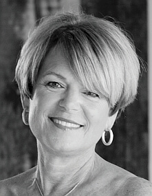
Cindy McCord
Cindy McCord Design
1289 S. DuBray Place Collierville, TN 38017 901.610.3907
Visit Website
Each project and client is unique, so when determining whether to use colorful or neutral tones depends on the client’s preferences, location of the project, and existing items to be used (if requested) must be taken into account. Neutrals are just as important as color in the overall scheme due to the fact that they play off each other depending on the direction of the project. If someone prefers a more monochromatic palette, splashes of color can be used for accent or interest. This can be done through a fun pillow fabric, artwork or accessories. If a client prefers more color, mixing it with neutrals can be effective and gives you the opportunity in the future to change the colors without having to redo the entire space.

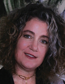
Warner Moore
Warner Moore Interior Design 475 North Highland, #12 A Memphis, Tennessee 38122 901.848.9832
Email Me!
Every designer has a multitude of means at their fingertips to create visual interest. I generally use neutral tones and soft colors to create a flattering backdrop for beautiful furniture, interesting textures, and wonderful objects and art.
I have found that tranquil palettes allow for flexibility when it comes to changing the elements of a room, as we all inevitably do over time. And perhaps since we spend our days immersed in pattern and color, we like to give our eyes a rest when we come home. In today’s frenetic world many people want a peaceful haven to come home to. A background palette of neutral tones throughout a house allows for color and contrast in accessories, artwork and flowers. It is also more versatile over time.
I approach the color palette differently depending on the room’s function and the client’s color preference, since people are naturally drawn to certain colors. I like to create quieter backgrounds in more heavily used spaces. This is not to say that bold hues are never used. Color evokes emotion, so I save the effects of strong color for the rooms that are less heavily trafficked – like a formal dining room or powder room.
When using bold color, I am extremely selective with a tendency to stay at the warm end of the spectrum. I like to create these bolder effects in powder rooms, dining room and guest bedrooms. Since these rooms are used less frequently, they can benefit from an extra punch of color and pattern.
Ultimately, a neutral background creates a canvas for layering the beautiful objects that you love, the art and furnishings that you respond to, and the accessories and accent colors that make the room work for you striking the balance of sophisticated elegance and comfort.

Steve Nabers
Nabers Interiors
2665 Broad Ave.
Memphis, TN 38112 901.323.2892 Facebook:Nabers Interiors
Visit Website
“The state of color has never been more restless,” according to the well-known paint company Sherwin-Williams, and I tend to agree. After the past few years of neutral palettes, we are seeing more and more color being presented at furniture markets, interior design publications, and industry offerings. My personal design philosophy is not to follow trends per se. However, if you don’t subscribe to the general industry direction for colors, you may have difficulty finding non-trending hues in paint, carpeting, fabrics, bedding, accessories and artwork. So, in one sense, the design industry dictates the design/color decisions we make.
The color schemes that I select for my projects vary from job to job and depend on many factors: the client’s particular tastes, existing art, fabrics and rugs if those items are going to be incorporated, and lighting, which varies for each space. I prefer not to tie myself to a particular or cookie-cutter type color scheme, but I do like consistency throughout a space for a seamless visual flow. To me, color brings in excitement and an element of surprise. However, I think care should be taken not to overdo it and to exercise restraint when using color in a decor plan.
If color is utilized well in a room, it can be timeless, regardless of whatever is trending. I still find it gratifying to look through old interior design publications, such as an Architectural Digest from the ‘70s or ‘80s and see a well-done interior, no matter what color, that is still relevant. Classic.
Rachel Gray
Rachel Gray Interior
Design & Consulting
496 S. Main St. #201
Memphis, Tennessee 38103
901.443.5454
E-Mail Me!
Visit Website
When it comes to interior colors, people tend to fall on opposite ends of the spectrum. Either you are a fan of neutrals, as expertly demonstrated in Nancy Meyers’ film The Holiday (2006), where the interiors of “Amanda’s” California home are awash in whites, or conversely, you may be passionate about color, as intensely depicted by Wes Anderson in creating the mood of the Tenenbaum home in his film The Royal Tenenbaums (2001).
Over the past decade, many people would argue that the protagonist in the story of interior colors is named NEUTRAL. Neutral palettes have been marked indelibly into our consciousness, particularly by advertising and marketing campaigns à la Restoration Hardware.
Wherever you fall on the spectrum, generating the ideal color choices for your home depends on several things…your cultural background, if you so identify, the orientation of your home to the sun, your existing furnishings and art, and your lifestyle. Vibrancy was a beacon star when determining color choices for a client who wanted to incorporate her Chilean heritage, culminating in selections of overall tones of yellow ochre and charcoal. Being mindful of how morning and afternoon light plays out in your home can also guide you in selecting colors that maximize your home’s potential. Morning light is clearer and purer than afternoon light, which tends to cast yellow and gray hues. Consider your existing art and furnishings to spark an idea for your home’s palette. A favorite painting might have an appealing color that can be matched and applied to the back of bookshelves for a special pop. And…always consider your lifestyle. If you have pets and young children, you may want to steer clear of neutrals, ut if you do decide neutral is the look you desire, select paint finishes that are durable and washable. “The makeup is simply an extension of the personality and colors and clothing all express something,” Gene Simmons. Whatever you do, express it with ownership.