Ultra Violet: Decorating with the Pantone Color of the Year

by Lesley Harris Colvett

Photography from thedecorista.com & wellandgood.com

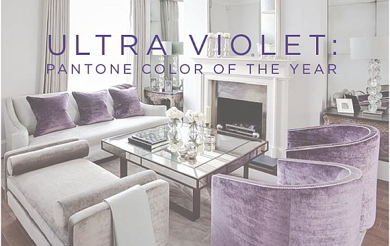
Annually, the Pantone Color Institute announces the Pantone Color of the Year, and according to the Institute, 2018’s Ultra Violet tone reflects “originality, ingenuity, and visionary thinking that points us toward the future.” “The Pantone Color of the Year has come to mean so much more than ‘what’s trending’ in the world of design; it’s truly a reflection of what’s needed in our world today,” says Laurie Pressman, Vice President of the Pantone Color Institute. The 4Memphis interior design experts share their thoughts on the color, and how to incorporate this vibrant color.

Warner Moore

Warner Moore
Interior Design
475 N. Highland, #12 A
Memphis, TN. 38122
901.848.9832
Email Me!

Pantone’s color of the year, ULTRA VIOLET! A very edgy choice, and challenging. Pantone’s executive director used terms like inventiveness, imagination and creative inspiration when describing the color. This is a color with a mysterious mystical character. A color which symbolizes originality and creativity. Bold colors can be demanding. We shouldn’t be afraid of them because they can give a room a much needed jolt! I love lavender all the way to the appropriate purple. There are several ways to use it. Violet works beautifully as an accent. Use purple flowers in your room. Iris, roses, allium or lilac. Perhaps some throw pillows that include the color would work well. In using a new color take baby steps. Amethyst geodes are very decorative and unusual as an accessory. If using in a big way, one can soften the strong color by using soft shades in the same color family. Such as lavender, blush, blues and pinks. To embolden the color even more use colors from the opposite side of the color wheel. For a library or study consider going all the way and embrace deep purple! Enhance it with other lush, deep, dark colors, velvet, jewel-toned fabrics, dark leather and dark wood. Try it in a powder room. What better place to use a wild splash of bold color. Wall paper or high-gloss lacquer finish. Think outside the box! Gray it down and it could be very romantic in the bedroom, casting a warm and soothing glow. Very enveloping. Try violet as an accent chair in the living room. Serves to unify the other colors in the room. This concept holds true in many of the decorative arts. For example, fine porcelain of the 17th and 18th centuries often employed purple in their design. Even a dot of purple served to intensify and unify the other colors. So we find that violet is more usable in our everyday decor than we thought. It’s also very royal!

Cindy McCord

Cindy McCord Design
1289 S. DuBray Place
Collierville, TN 38107
901.610.3907
Visit my Website!

With the introduction of the new color for 2018, it can’t help but make us all rethink color after a much popular trend of subtle and neutral color. Color is definitely making its comeback! But sometimes our pocketbook can’t keep up with the changes that are tossed our way in every magazine we pick up. If you are wanting to introduce the Pantone Color Institute’s new color - “ultra violet”, I have a few suggestions for those wanting to keep up with the trend. If you have gone neutral with your decor then you are in luck to go “bigger” with this new color by adding beautiful silk pillows or upholster a small accent piece such as a stool or chair. While this is not a color I have used much in the past, I would find a way to make it timeless by starting with touches and not a complete makeover. For those who have already chosen a different direction and cannot incorporate the new “ultra violet” in your decor, you can always use the popular new color in fresh flowers. Always let your love of a color make its mark, whether it’s a throw, pillow, decorative piece, or floral arrangements. All can be easily changed and starting small won’t put quite a dent in your budget if you decide you need another change.

Rachel Gray

Rachel Gray
Interior Design & Consulting 496 S. Main St. # 201
Memphis, Tennessee 38103 901.443.5454
Visit my Website!

Before jumping on the bandwagon of the new “Pantone Color of The Year - Ultra Violet,” you need to ask yourself…do you think you can be bed partners with purple? While purple, or more specifically “ultra violet,” is expected to be the “it” color, you should exercise caution when testing the waters. Color has a direct effect on mood. The psychology behind this color suggests associations of wealth, nobility, and prosperity. Conversely, purple can impart negative connotations, eliciting loneliness and sadness. Therefore, I suggest using purple as an accent color before painting or wallpapering an entire room. There are beautiful works of art available in local galleries that can make a statement without overpowering your interiors. My personal favorites are works by Veda Reed (www.davidluskgallery.com) “Sunset - Belt of Venus,” Chuck Johnson (www.lrossgallery.com) “Balance,” Jimpsie Ayres (www.jimpsieayres.com) “Prayer,” and Robert Yasuda (www.davidluskgallery.com) “Vintage.”

Anthony Shaw

Anthony Shaw
Antiques & Jewelry
Chickasaw Oaks Plaza
3092 Poplar Ave, #7
Memphis, TN. 38111
901.454.6200
Email Me!

As a designer, I watch and follow trends. But, my aesthetic varies and I always want to convey an underlying element of timelessness. Although beautiful, trendy colors such as ultra violet have a short shelf life. Like fashion, they come in and outthere’s always a hot color. A simple black dress is classic and interior design is no different. These elements should be done in small accents and in moderation such as pillows and interesting objects. Playing with these of-the-moment hues in small doses makes it fun and easy to switch when the next trendy color comes along.

Share Decorating with the Pantone Color of the year from 4Memphis Magazine!